Saturday 23 July 2011

Schoolism Assignment 9: Finishing: Step by Step fleshed out- Day 4

Here's where I was at the end of day 3 of coloring (do go back to the previous two posts to see days 1 and 2-3). Pretty much the cow was colored, the background finished, and I was ready to put in brambles as I had tried out sketchily on a layer the previous day.


Here you can see my bramble references, and I have drawn in the brambles mostly with a fairly small dark airbrush.


Here I have zoomed out and am trying brambles in the upper left hand foreground as well.


I tried drawing in more brambles in the lower left, but found it was getting too confused. What I then did was copy and paste the bramble layer, shift it off to the left and down a bit, so I had duplicate brambles, and lowered the opacity on one of the two bramble layers to give depth, and also erased a few stray brambles. I suppose it "shows" that I have copied and pasted, but I didn't really mind the repetition, since it gave depth and more brambles without actually adding more shapes and thus more confusion of forms. I liked the relaxing repetition of the lines vs having it just look like a big tangled ball of wool. Not sure if this was the right decision, but it still doesn't bother me, weirdly, since I often look for cut and paste in illustrations and it annoys me. :)


I decided the brambles in the upper left, over the sky didn't so much "frame" my character as trap her, so I erased them completely:


Here I am drawing in the wee flies around the cow as their lines had gotten so smooshed doing the background:


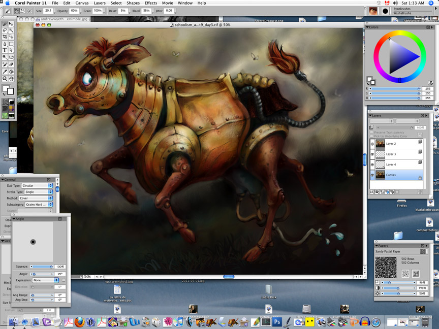
Taking a look at where I'm at.


Using the FX Glow to put in more glow on the cow's armour:


Looking at my prof's robot eyes close up, and trying to do some of what he did with shading in the eyeball and iris. Rather unsuccessfully.


Working last bits of texture on armour, including rivets around eyes. I put too many!


Ready to put the canvas texture overlay:


"painting" finished:


Capturing a canvas texture:


Opening it as a Painter file so I can copy it:


Copying the canvas texture over my painting, tiling it. Since it had a slight gradation, darker to the right, I flipped the right hand "tiles" so that I didn't get a hard value-change line where they meet.


Finished tiling the texture:


I've erased a bit where the "tiles" of canvas overlap to make the lines a bit less straight and obvious:


Making all the canvas tile layers into one Group and collapsing the group:


Here is what my image looks like with the canvas texture layer closed:
I liked that the colors were quite saturated and moody:


And here is what the image looks like with the canvas texture layer turned on, and set to overlay, at a low percentage opacity. I find it really lightens/brightens up the image and loses a lot of the moodiness and feeling of dread, as the canvas is quite light and cream colored.


So I tried adjusting the color of the canvas layer, bringing down the saturation of it, so it would be greytone rather than cream colored, to see if that helped.


I didn't think that worked enough so I junked it and started over again.


I tried desaturating the canvas layer right from the start before changing it to overlay.


I liked that better. Though I still wasn't crazy about the canvas texture. I did a lot of erasing it out in places, esp on the background, where I felt it overwhelmed the atmospheric sky and on the cow herself where I felt it interfered with the shiny look of her armour. Here I am comparing against my prof's final painting for this assignment. Oh, I also airbrushed some more blue into the cow's eyeball which had really gone totally white from the glow brush at the center of the orb.


Here's my final work with canvas overlay. Hopefully if you click on it, you'll get a large enough image to be able to see the texture which I dislike and feel is kind of "cheap" (like a fine master painting printed out in a print shop on a cheap canvas stretcher). [hmmm, it appears that my screenshots of my work in Painter are much more saturated for color than the Photoshop equivalents in psd or jpg that I post here... grrr]


Here's my final work without the canvas over it, which I prefer.


I still prefer the painting with no brambles in front. I feel that it works better for the cow to not be hemmed in. Perhaps for a portrait of a static character, it is nice to frame it in, and darken around the edges of the canvas on all sides, but I feel that the brambles cage her in and stop her forward hurdle into escape. I also feel that it weights the image too equally. Without the brambles on the left, our eyes follow her eyes behind her, where there are the dark, rather sharp focused tree shapes on the horizon, and we fear what we don't see out of the frame. With the brambles in front, they balance out the dark, as well as the sharp detail, behind her. Also without the brambles, there is a nice contrast between the defined cow character, and the soft background which pushes back away from her, bringing her more into focus. And there is also the nice transition from the sharp dark tree shapes in the back right horizon, to the softer less defined and lighter horizon to the left. Ahhh well.


I also feel that I overdid the blue glow brush on the armour and probably also her eyes. I lost the shape of her eyes too between the black and white (where there is darker overhang of the eyelids only on the left side of the eyeball) and the final color image (where the dark blue shadow is more equal over the whole top of the eyeball), so her eye has less character and emotion. The fly behind her butt in the trees should come out as it is just confusing. etc etc etc.

But all in all I am pretty happy with the final illustration, and feel I have learned so much about Painter: brushes, "cover" types, adjusting colors (saturation, value, hue), different layer types, combining layers, using lasso tools as masks, bringing back parts of "lost" drawing into a painting, using references, adjusting using the transparency slider on the layers, varying areas of detail and focus, etc etc.

And I still feel I have barely started to scrape the surface. But if you look in this blog at what I was doing with the cintiq and Painter when I started it, and now, the differences of ease and skill are astounding.

The Schoolism Painting in Painterclass was definitely worth my time and money. A great investment. Thanks to the Schoolism team who troubleshot all sorts of technical issues, and my prof, Ryan Wood, for his clear video tutorials, his calm encouraging voice, his help with questions, his detailed individual aid through the video critiques of our work, and all the other students who shared their work and their critiques online. Best of luck to everyone.

Schoolism Assignment 9: Finishing: Step by Step fleshed out- Day 2-3

Here's where we left off with the robot dairy cow image at the end of day 1:


Again comparing my color version with the Wyeth color reference and my black and white version... airbrushing over the whole image with it zoomed out, with more saturated yellows, oranges and reds to bring it up to the saturation level of the Wyeth... it was just tooo pale:


Fixing back foot:


Changing horizon line in front of cow to descend, by scribbling with a yellow grey airbrush, also beneath her body and front foot, to silhouette them as they were getting totally lost in dark:


Addng in a few more darker shapes in the front horizon...


Using the lasso tool to select the bottom of the cow, so I can go in to mush up the airbrushing I did in the background without painting on her body, with brushy blending marks using the Sable Chisel Tip Water brush:


Going in and refining and brushing out with the Ultra Fine Wash brush, blending where I had used airbrush, pens etc:


Cleaning up and blending around the edges of the tail and the chainmail skirt so they don't look so pasted on to the background, and fit more painterly into the sky:


Working on the hoses on the milking machine:


Working on the drops of milk coming out of the milking machine hose:


Working on blending her eyeball:


Continuing to wash and tighten up different areas with the Ultrafine Wash Brush, esp in the milking machine area:


Here is where I am attempting to use the Dirty Marker brush that my prof uses so often to put in more dark and random colors into areas. It is totally just making a mess: I seem to get just wide flat swatches, too saturated, or narrow chisel-shaped swatches. What a mess!


Here I am attempting to put some scumbling into the sky (as we can see in the upper left corner of the screen on the sky of the Wyeth painting) using the Dry Bristle watercolor brush (having deleted all the Dirty Marker!). Again. Yuck.


Trying a Simple Round Wash watercolor brush to see if that is any better: nope.


Trying to see if I can do anything interesting to get the texture I want out of the watercolor layer I put down, by erasing some of it with the Watercolor Eraser Dry brush. Nope again:


Looking at the end results of using different Watercolor brushes and the Eraser Dry brush, zooming out to see if there is anything worth saving. Not really!


Here, I've chosen a French Watercolor Paper type, and upped the contrast to get an interesting paper texture, with the intention of rubbing Pastels over it to pick up the texture and get some roughness into my armour (I have lassoed the shoulder armour). Weirdly enough the pastel is going "pastel" (haha, ie like "pastel blue" instead of "deep blue") ie whiter and lighter, when I don't press hard on it. No idea why. And it only picks up the texture of the paper if I don't press hard. I only get the color I want when I press hard, but when I do, I fill in the paper texture with the pastel. Fail:


More of how this is NOT working!


I've managed to get what I want, saturated color, picking up the texture of the French Watercolor Paper (which I have played around with the resolution size as well as upping the contrast), by using the Square Chalk brush instead of Pastels.


Here you can see the results on the shoulder armour: using different chalk colors, and making different hard edges by removing some of the lassoed selection for each section of armour:


How it is looking zoomed out:


Doing the same texture thing with the paper and Square Chalk 35, on the armour of the neck and face. You can see here I have made the paper texture really fine by dialing down its size (upper slider on the paper palette window):


Working on the texture the same way on the stomach of the cow:


Here I am using Focus-Soften, to make the armour around the rear leg of the cow less "sharp" so it isn't equally as detailed on the back of the cow as on the face, and our eye will be less drawn back there:


Coming back to work on "highlights" now on the armour now that I have put in a lot of darker texture. Airbrushing in blue light that would be reflecting from her glowing eyes:


zoomed out:


That was the end of working on day 2 of coloring in the assignment.


Here I am starting on the third day of coloring in:

Coming back into the cow's tail and hair to mix it up, using the Real Soft Colored Pencils again, as well as refining the back foot and grass where they meet:


Taking a look at the illustration, I thought it looked like the milking machine hose and drops weren't between the two back legs but actually in front of them. so I copied and pasted just the hose, and moved it up quite a bit, so it would be going back:


Here I've painted out the original milking machine hose:


I also thought that they were so bright they are competing for attention with the cow's face and eyes, so I am adjusting the color and bringing down the saturation, and also making the hue a bit darker, less bright turquoise (which I had originally put in exactly TO match the eye color):


I also found that the udder was too turquoise and close in color to the background in front of the cows front left knee, so I am changing it to a more navy blue using adjust color: hue:


Happy with the new cow udder color, as I feel it doesn't get lost, and also doesn't draw attention from where I want the focus to be on the face:


Fixing the texture and shape on the front of the cow's brow, again using a lasso, and the square chalk:


Again, having trouble with the colors of a brush: again, like the Pastel brush earlier, on a new layer, the Real Soft Colored Pencil which I had used earlier directly on the canvas quite nicely, is going "whitish" when I don't apply heavy pressure. Why oh why?


At this point I again felt that the back parts of the cow were too sharply textured, so I repeated what I did to soften the focus on the rear hip armour, with the belly armour of the cow: focus-soften-gaussian:


Checking how things are coming along, with the blurrier areas further back on the cow. Also smearing around a bit with the Brushy brush (one of my prof's custom RyanBrushes, along with the Washabrusha). Looking at it I realized I still really hated the trailing milking machine and drops of milk which just are wrong and stand out too much.


Choosing the Washabrusha and just painting out all that part completely, using colors picked from the background grass:


Using the Real Soft Colored Pencils to completely redraw the milk machine hose and drops:


Painting in the new milking machine hose, in darker colors instead of lighter this time, to silhouette against the grass, and be BEHIND the back foot nearest to us:


Decided I didn't like that the skyline went up in the back and in the front: using a light grey yellow to airbrush over the darker bushes in the left horizon, and extend the sky down to give an angle:


Airbrushing a dark shadow under the cow to hold her to the ground, and make her less floaty:


Using the Real Soft Colored Pencils to draw in trees in the background behind the cow:


Further work on the trees:


Taking a good comparing look at my reference material and my painting, comparing the levels of color saturation, range of values, horizon and sky colors and textures... Not bad, compared to where I started with pretty mushy soft, undersaturated colors and textures:


Then before I hung it up for the day, I quickly put in another layer to try out putting in brambles in the immediate foreground in front of the cow, much like my prof put in cables in front of his robot in his tutorial painting, just to see what it looked like blocked in sketchily:


So, to compare, here's where I was at the end of day 2:


And where I was at the end of day 3, ready to put brambles in the front left the next day:


And a comparison of the end of day 3 with the Alla Prima painting I'd begun with at the start of Assignment 9:


Do click on the next post to see where I got on day 4, putting in the brambles and finishing up by adding canvas texture. (and if you are reading this and didn't see the first part of this step by step, do go back one post!) Thanks!