OK, I decided to edit this to point out what I am doing at each stage. Hopefully that will be helpful.
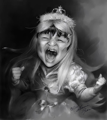
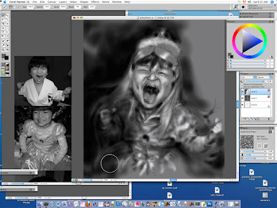
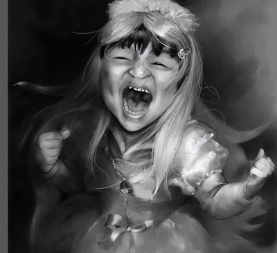
This first image is the final drawing. I tried to get detail in some areas, and rest areas for the eye in other spots. To differentiate between different surfaces, like the fuzzy hoodie, the hair, the wig, the fuzzy tiara, the shiny dress, the skin. I also tried to have deep tonal differences from dark blacks to white whites (see back a couple posts the Ingres reference given to us by our teacher, Ryan Wood).
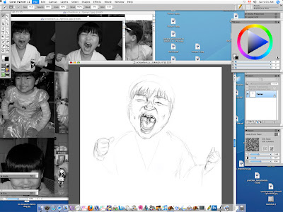
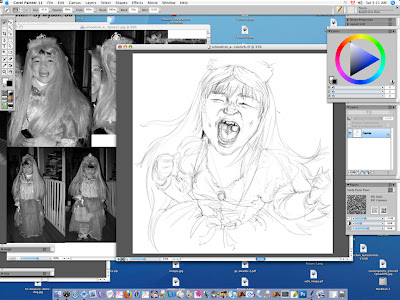
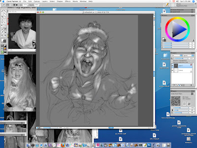
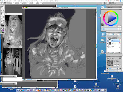
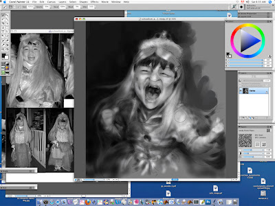
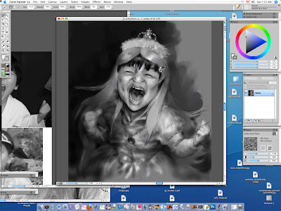
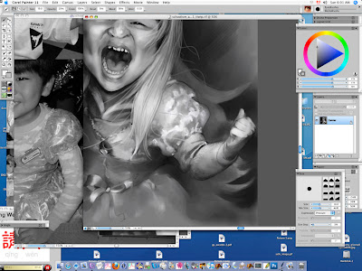
I started by drawing my son shouting in his karate suit to capture the size and shape of his bod. The two fists are from two separate karate class photos, as are the eyes and the mouth.

Here I am drawing in the mouth and eyes properly after having established the shape of the head and body.
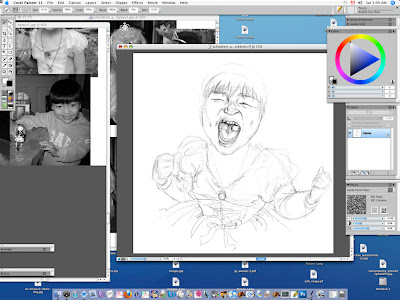
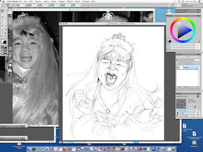
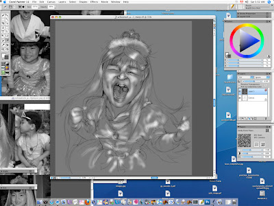
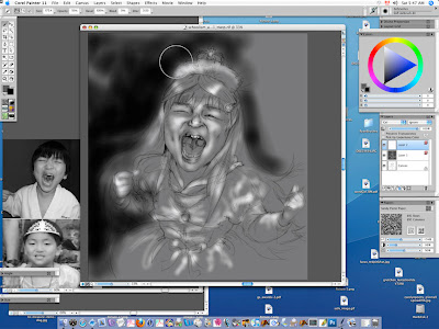
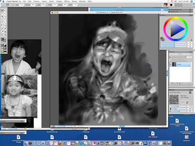
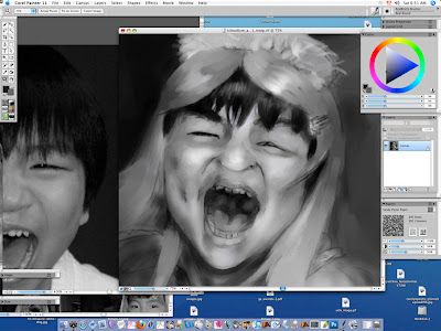
Next I looked at two photos of my son in his princess dress from last summer and Christmas 2009 to draw it on the karate body.
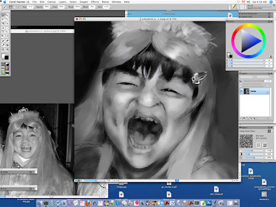
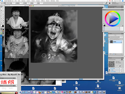
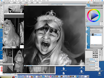
Here I look at a photo of him dressed as a princess for Halloween October 2009 to draw in the hair. I tried to get it swirling around to give interesting shapes that cut into the background, as well as be appropriate for his action pose. I especially wanted to show that it was a wig by having his black bangs hang out conspicuously.
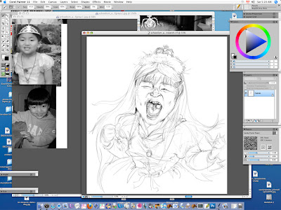
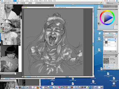
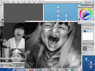
I realized I didn't have enough space to fit in the tiara so I added another couple inches to the top of the canvas, and drew in the tiara.
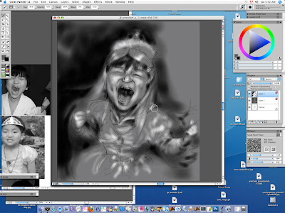
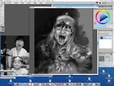
I decided to put some texture contrast in, as well as contrast the princess dress to his regular boy clothes so it comes across more as a costume by using an old photo of him in a fuzzy hoodie to draw in the hoodie arms and neckline. This took a bit of imagination.
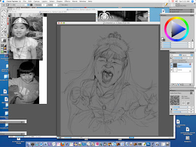
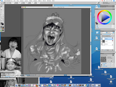
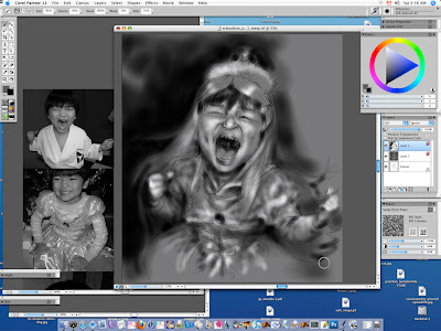
Satisfied with the sketch, I added in a layer, dropped in a grey tone fill, and turned the layer to "gel" to establish midtones and see the sketch through.
I start using an eraser brush tool to rub white highlights into the grey layer.
Doing some tightening up with the pencil tool: Real 2B Pencil.
Finished putting in white highlights, I add another layer to do the dark tones on. (see three layers in layer palette to the right side)
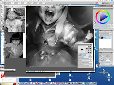
Starting to put in the darkest black areas with an airbrush tool.
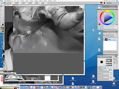
I was having a hard time making the background black as the airbrush tool on a wide setting was too slow: too much memory. I tried using the lasso tool to outline the whole left side and drop in a dark grey (which is a bit bluish), but I didn't like it so I deleted and started again with the airbrush.
Here I am redoing the background with a large airbrush. Frustrating as with the lag, I kept overshooting and coloring on the edges of my person/foreground. and I found the background to come out really spotty.
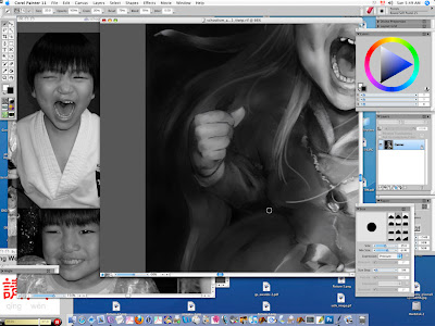
Starting to work into the hair and arms with the black airbrush.
Here I've put a lot of black all over: face, hair, arms, dress, brooch.

Working into the ribbon on the front, dress texture, and hair lower right.
Standing back, I thought that the drawing was too even and part of the assignment was establishing darks with detail and lights with detail. So I used a large airbrush to go over the whole left side, arm, fist, hair, dress, with a low opacity black spray.
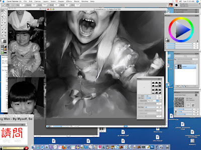
Here I have dropped all the layers to start painting with a paintbrush You can see I have washed over all of the dark background, and the right side beside his head: big brushstrokes visible picking up the color already laid down.
Startig to use the brush tool on his face and fists... the points I want the most detail and to come forward.
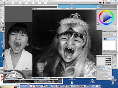
Looking at my karate face reference to paint the face details.
Lightening up the areas I want to come forward more by spraying white airbrush right over center fae, his right shoulder, hair and arm.
Zooming in to work on the face with smaller brushes. The basic hair tones and facial tones have all been painted in.
I was having a hard time getting detail or dark blacks with the brushes which were picking up underlying greys, so I "cheated" and went back in with the 2B pencil tool to define his eyes, mouth, etc. You can see I have used a dark bristly brush to put in his black hair, and (badly) an overdone eyebrow on the left. ewww!
I've gone back in with the pencil here there and everywhere I wanted a bit more darks, and I also whitened up his teeth and got the right shapes on them.
Again "cheating" with the 2B pencil, defining the edges of the hair in the front, and his sleeve and fingers.
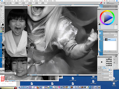
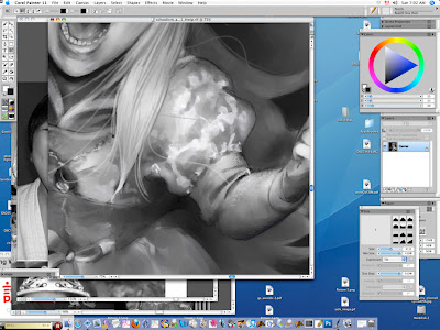
Here I've done several things: Used the 2B Pencil in white to scribble on highlights on the hair, nose, dress texture and ribbon, then used a small brush to paint over the white pencil, and in this actual screenshot, using the black airbrush to push back the elbow and left side of the dress and face and hair.
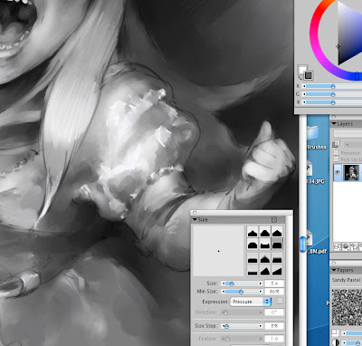
Working on the dress.
Closeup of dress detail (I had "painted over" the white 2B pencil).
Here I am using the soft pastel to add texture to the neck of the hoodie.

Smoothing out the hair, more background painting on right side. Generally making sure it is painted everywhere and not just the gray layer showing through.
I was getting really frustrated with this soft smooshiness of the brushstrokes and how even it was everywhere, so I went back into the hair with the 2B Pencil brush in various shades of grey from white, midtones to deep almost black.

Here you can see I have just gone wild with the hair, making a bunch of unruly hairs flying about over his face, the dress, background (haha! This is really committing to those areas as I can't change them up much once there is a thin pencil line crossing them!)
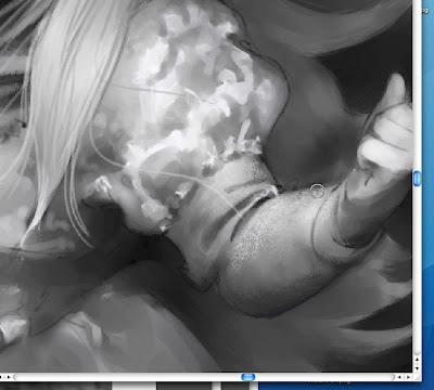
A closeup of the work on the hair.
Going back into the hand and sleeve on the left side.
Here I realized I hadn't added pastel texture to the hoodie sleeve to match the neckline. And you can also see my "scumbling 2B Pencil in white" technique for adding highlights to the dress which I then brush out. I am sure this is not kosher! :D
Detail of sleeve scumbling and pastel texture.
Working pastel into the other arm.
Using the brush to change the white pencil on the dress sleeve to brushstrokes highlights.
Putting white highlights with the 2B pencil on the tiara jewels and tinsel in the tiara fluff.
Working on the lip shape.

More lip fixing. (cursor is on lower lip just right of the center).
Detail of the above. Also fixed the tongue and back inside of mouth, and added highlights on the front of tongue for saliva.
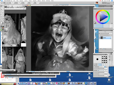
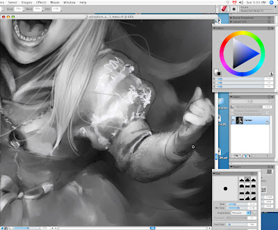
I decided that I wanted the attention to be on the top of the right arm, so I brushed out the dark pastel texture under the arm. Too much. So I redefined the sleeve with a dark 2B pencil (do we see a theme here of using the pencil as a crutch? lol!)
Painting out the dark pencil to look more painterly, and fixing the painted background hair.
Adding a bit more pastel on the arm for texture after painting it out: white on the top, and a mid grey instead of almost black beneath the forearm.
Arm/sleeve texture detail:
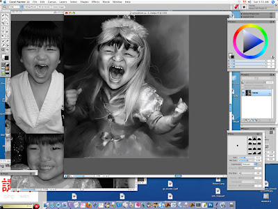
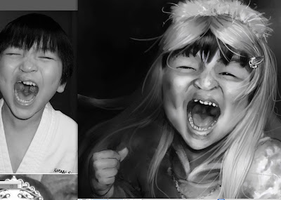
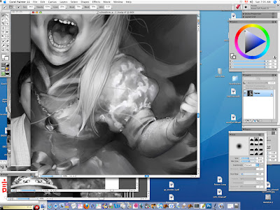
Enough is enough! The finished drawing! Not bad, my evolution using the cintiq and Painter 11 since I did
this self-portrait on Feb 15! Yay! Now we'll see what my teacher has to say in his critique. I have learned so much in just one week... so looking forward to the next lessons.

OK, so there, edited since I posted this earlier on Sunday, to write down what I was doing at each step... a bit less of a "can you see the changes?" game! Hope you enjoyed it!